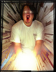
Charlie Chaplin helped found UA, so I added this 'ghost' image of him leaning on the logo.
Music is such a huge part of film that I put the logo on a set of bars in this Logo treatment I did.
I took this tube look, into a few comp ideas like this one, with a metal filament inside the font that would light up and glow from within the orange l glass material. Motion Graphic ideas with glass are endless as you can get some great internal refractions and caustics to travel the sculpt.
For this alternate I did the "A" as a heat-sink with the various flat plates creating the look.
A simple UA in a circle with three layers of metals Chrome, Gold, and Copper.
Project Review
United Artists Logo Update
PART II
Client: United Artists via The Cimarron Group.
Art Director: Myself and others.Project Date: Fall 2007.
This is my second posting for the logo work I helped out on when I was in-house at The Cimarron Group back in 2007.
The owner had every design division, MGFX, DE, HE, Corp, and 3D all do some ideas for the big pith to United Artists to develop a new look to the film company logo. The exercise was a great design challenge, that allowed me to review the history and purpose of the studio, as well as take it into a direction for the future.
Though we did not use these, or even present most, it certainly was something that I got to thrown my own skills at, along with the talent from the various other teams.
Cheers, THOM
You can view PART I here
You can click the link title to read a bit of history on UA or paste this text into your web browser and go!
http://en.wikipedia.org/wiki/United_Artists


No comments:
Post a Comment